With the new board design we introduced for SparkChess 10, some people were left wondering if the change was really necessary. After all, the old design has served the community for almost ten years and people grew attached to it. Far from us to pursue change for its own sake. In this post I’ll try to explain the reasons for the redesign.
UPDATE Nov 06, 2018: The post was updated with the results of a professional survey on the matter.
Ancient history
In 2000, SparkChess (then called flashCHESS) was the first online chess game that did not rely on servers to do the “thinking”. It was a time when Javascript and HTML were too young to handle chess engines, so we wrote the game in Flash/Actionscript 1. No one even thought it was possible to write a chess engine in AS. The engine had many problems but it was still hugely successful. The first Javascript engines appeared only later.
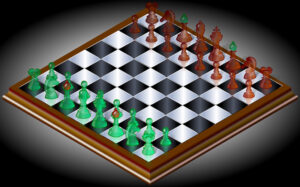
The game had to be very small so the graphics were quite limited. At that time, broadband was still a privilege and many were still connecting to the internet via dial-up modems. We used a 2D vector board and later a 3D isometric variant. It doesn’t look like much, but believe me, for the time it was perfect. The simple vector graphics ensured a very small size. To put things in perspective, the image on the right is larger than the whole game was!
Ten years – one design
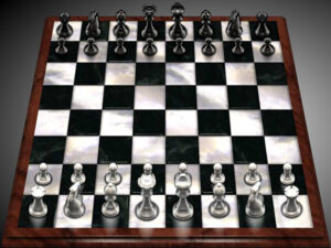
SparkChess 3 was the first to feature the fixed perspective you know. I spent quite some time figuring the “perfect” angle and perspective of the board. Initially I used a marble texture for the board and actual white and black colors, but it proved to be a poor choice, with bad contrast (see how black on black looks).
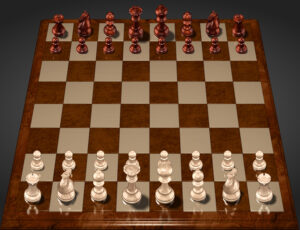
I replaced it very quickly with the wood textures you know. It was a very quick job. The wood textures made everything warmer and nicer and I added real shadows and reflections, but there were still issues. There was still not enough contrast for black pieces on dark squares, while the reflections of the white pieces were too prominent.
The new design
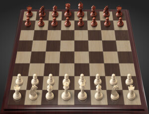
For SparkChess 10 we introduced a new 3D board that can be rotated, panned and zoomed, in addition to the standard board discussed here. For this new board I had to use a different chess set, one optimized for real-time rendering. And since the dynamic 3D board uses this new set, it made sense to use it for the fixed board as well.
Aesthetically, the new set is more delicate, but it also solves some issues in the old one. The knight is much more recognizable and also the bishops are more differentiated from the pawns.
The textures, apart from being more elegant, finally provide enough contrast for black pieces on dark squares. The colors of the squares are more subdued, helping the pieces stand out.
The lighting is also improved, with subtler shadows and reflections. The new light and shadow play also help white pieces in front of other pieces stand out more.
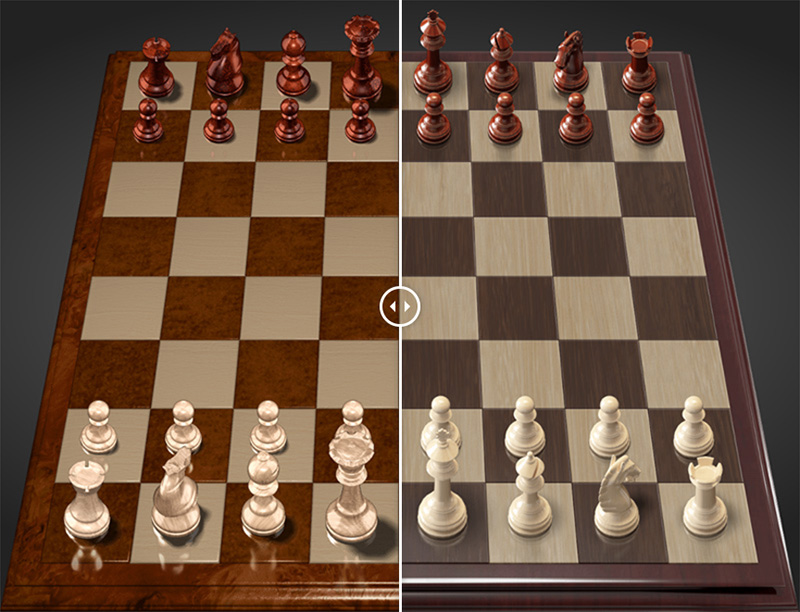
Have a look at the Before-and-After below:
As you can see, the overall contrast and colors are the same. The dark squares are different, to make black pieces stand out more. The textures, shadows and reflections are smoother. The pieces are more elegant and more differentiated.
Just for reference, here’s the new dynamic 3D board:
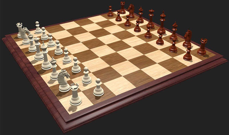
As you might have grown attached to the old board, I hope you’ll come to like the new one, too!
UPDATE: The popular vote
To put this matter to rest, we commissioned a professional survey. 400 respondents living in the US, from all walks of life, were asked if they preferred the old or the new design. The new design won categorically, 62% vs 38%. The margin of error of the survey was 5%.

I think we can safely say that the new design is the better one.
Cool
This one looks older than the 1st one
The only criticism I can think of is that the pawns look a little to big in comparison to the other pieces.
The board is fine. There is a glitch now where half the time the guest wins but gets no points.
We’ll look into that.
the board is elegant. but why you don’t give other features for free and make a more advanced one and sell it for 20$.
What features would you want to be free and what advanced features would you think we should charge for?
Development and maintenance of the product, site, multiplayer service and so on is expensive. We strive to keep a balance between ad-supported free functionality and “premium features”.
The board works fine. [Hack bug report removed] I wish they would address that.
Liam, if you have specific knowledge of any hack cheaters can perform, please contact us! I don’t think the hack you described is possible, but we need to verify.
I don’t quite love your taste, but i do like it.
I think that basically you miss the point tho.
There is no perfect chess board, 2D or 3D.
It’s like beauty contests. [Well i prefer short hairy fat women!, and some women prefer short hairy fat men!]